Typography today is no longer static. It breathes, scales, and adapts—blurring the lines between function and expression.
The Challenge
Modern design
The Insight
Turn a boring topic into an exciting website
The Solution
Bold typography with real estate imagery
The Aesthetic
Dark, premium financial-tech
The Impact
converting complex financial services into an approachable journey
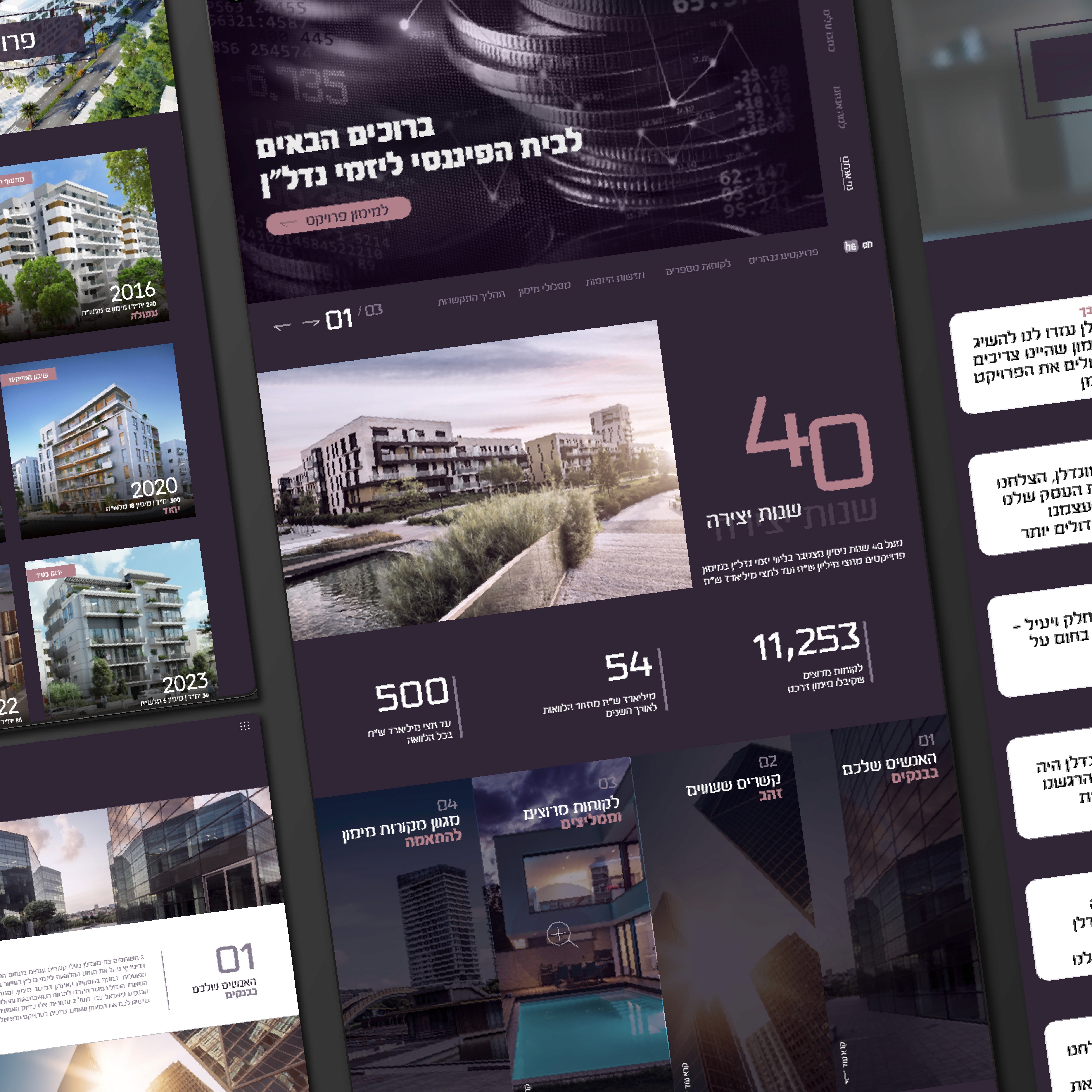


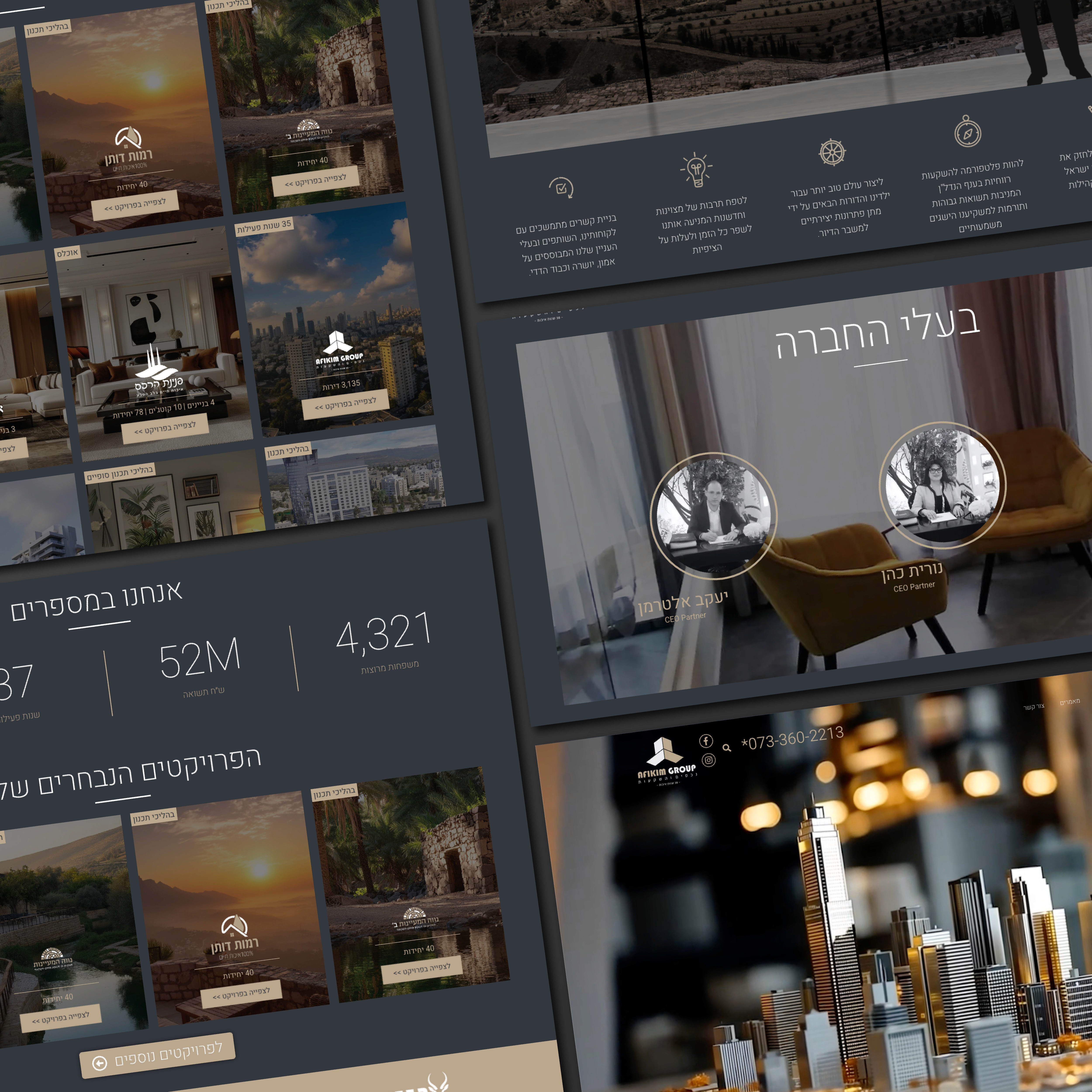
The Challenge:
Real estate financing isn't exactly the most visually exciting industry. When Mimunadlan approached us, they had the expertise 40 combined years of experience and over 7 billion shekels in loans - but lacked a brand presence that matched their ambition. The challenge was clear: how do you make financial services feel dynamic, trustworthy, and memorable in a market flooded with conservative corporate identities?

The Approach:
We chose to break from traditional finance aesthetics entirely. A bold purple palette replaced the expected blues and grays, signaling innovation while maintaining sophistication. The typography strikes a balance between modern edge and professional weight. Every visual element. from cinematic property photography to data-driven statistics - was designed to transform complex financial concepts into an approachable, confident narrative.


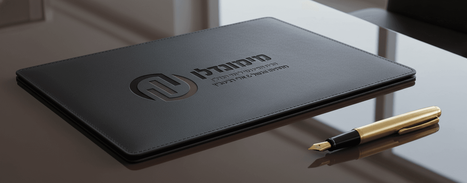
The Result:
The final identity positions Mimunadlan exactly where they needed to be: young and fresh, yet undeniably premium. The website doesn't just inform-it impresses. Visitors immediately sense they're dealing with industry leaders who think differently. What started as a "boring finance company" now stands out as a brand that commands attention and builds trust from the first scroll.